

5 Easy Ways to Improve Your Homepage
“Your company’s homepage is your home base, your shop window, the cover of your company’s book that you’re bound to be judged by.” —Zoho Academy
Metaphors aside, your homepage acts as your business’s first impression—and unfortunately, people are very quick to judge when it comes to websites.

How quick, you ask?
One study found that it takes just 50 milliseconds for a user to decide whether or not they’ll stick around. Simply put, with such an abundance of great websites out there, the level of tolerance for a not-so-great website is low.
Don’t believe us?
Sweor put together a quick comparison of two homepages, writing that they “can guess which website you’re more likely to hold in high regard”:
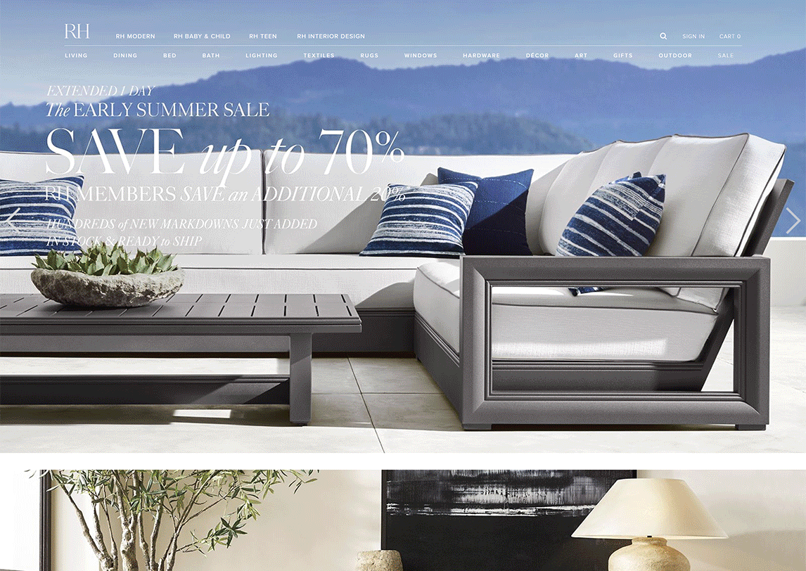
Image source.
You totally just judged!
So, today’s topic is how to improve your homepage—an activity worth your company’s time considering the page accounts for about 50% of your website’s total pageviews.
Here are 5 ways to increase your odds of hitting a homepage run:
1. Do the five second test.

UsabilityHub defines five second testing as:
“A form of usability testing that allows you to measure how well a design quickly communicates a message.”
Key words there are quick and communicate—remember those snap judgments we were just talking about?
The goal of a five second test: to find out if visitors get the gist of your product or service in 5 seconds time or less.
Doing a five second test on your website doesn’t need to be fancy.
Here’s how to get started:
-
- Take a screenshot of your homepage. Note: consider blocking out your logo if it gives away too much information.
- Find someone who’s never seen your website before (and doesn’t know your product). Note: don’t tell them you’re going to ask them to recall what they’ve seen.
- Show them your homepage for 5 seconds.
- After 5 seconds, ask them a few key questions:
-
- What was this website about?
- What words/phrases do you remember?
- Who do you think this website is for?
- What do you think you’d see next if you scrolled down?
-
Remember, you’re looking for big picture answers here, like “you’re a real estate company and you do a lot of luxury stuff” or “you sell dog food… and I think it’s organic.”
Their responses should help you better understand whether or not your homepage’s headline, subheadline, and hero image are doing your business justice.
For more details and tips on the five second test, check out this 2 minute video.
While we’re on the topic of hero images…
2. Have a hero image or hero background video.
A hero image is that big, high-quality, full-screen image that’s front and centre on your homepage.
In many cases, your headline and subheadline are positioned on top of your hero image, like in this Fresh is Best example:
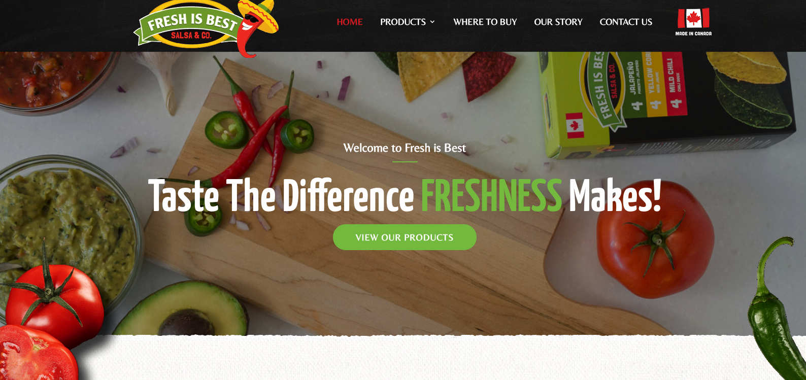
Image source.
Why are hero images effective? They help visitors identify with your brand right away. If we think back to the five second test, adding a visual clue to supplement your copy would only be helpful.
Picking a hero image should be a thoughtful task—do you want to…
-
- Showcase your product? (Craving guacamole now…)
- Add context?
- Evoke emotion?
- Highlight a benefit?
Neil Patel breaks down when to choose what hero image in this great article.
Want to take it a step further?
Try out a hero background video, which are shown to boost conversion rates by 80%.
You know the whole… a picture is worth a thousand words proverb?
Well, 1 minute of video content is worth 1.8 million words (James McQuivey).
3. Write clear copy.
The text on your homepage serves as your elevator pitch—meaning it has to be brief, persuasive, and memorable.
No pressure.
The good news?
Just editing what you have can result in a 124% increase in usability—meaning it’s worth your time to review your homepage copy with the following 3 questions in mind:
-
- Is it concise? Read this blog post for tips on optimal length. Long story short—”it’s not about short or long copy. It’s about writing just enough to convert the prospect”.
- Is it scannable?79% of users scan new pages; 16% read word for word. Note: scanners become readers when there’s a good page layout.
- Have you gotten rid of all of the marketing jargon?

As a general rule of thumb, avoid superlatives (words ending with -est, like greatest or best) and hyperboles. Best to just stick to the facts.
In the words of Foundr:
Anyone can say this:
We offer the finest and fastest auto repair services in town—guaranteed.
But, how much better is this?
Get your car fixed in 48 hours or receive a 30% discou

4. Include social proof.
We all can relate to the situation of trying to decide where to eat in a new neighbourhood and feeling most inclined to pick the restaurant that’s busiest.
“All of these people can’t be wrong, right?”
Well, your homepage is your digital storefront, so it only makes sense to prove that your product or service is the more popular, or busier, option—especially to new visitors.
How do you do that? Add social proof.
Testimonials, statistics, client logos, awards, reviews, press coverage—these are all examples of homepage elements that add credibility.
Sprout Social defines social proof as:
“The concept that people will follow the actions of the masses. The idea is that since so many other people behave in a certain way, it must be the correct behaviour.”
Obviously, the more social proof you have the better, but it’s probably a bit intimidating to find and organize it all at once.
Get started with finding (or perfecting) your company’s featured testimonials:
“The power of testimonials lies in their objectivity. That is, someone outside of the brand does the talking, so, in theory, their credibility is higher.” —Neil Patel
5. Make sure it’s responsive.
To stay competitive, your company’s website needs to be responsive, meaning it needs to offer an optimal viewing experience across all devices (by responding to all screens).

Otherwise put, when users visit your website on their phone or tablet, they shouldn’t have to pinch to zoom in and out to navigate your content.
There are lots of reasons to have responsive website—visitors expect that you will (and are disappointed when you don’t), it makes for a better user experience, and Google will give you brownie points.
Our latest blog post on this exact topic tells you how to go about creating a responsive website.
Conclusion
Homepages are dynamic, so don’t worry about getting yours perfect the first time. A successful (read: high-converting) website is a result of lots of trial and error.
I’ll leave you with some great tips from a Hubspot article on the 7 simple A/B tests that all companies should run on their homepage.
Some of the elements they recommend playing around with include:
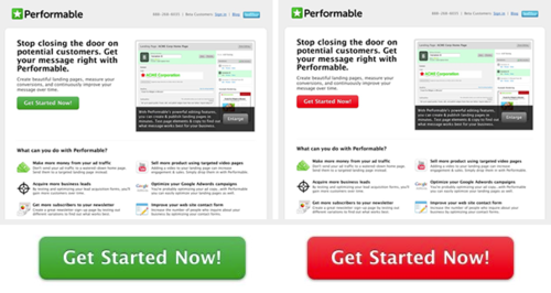
Image source.
-
- the colour of your main CTA button (e.g. green vs. red)
- the order of your navigator bar tabs (About Us, How it Works, Contact Us)
- your hero image (e.g. product vs. people)
- your headlines
- the phrases you’ve decided to highlight for your hyperlinks
Like I said, it takes lots of experimenting to get this stuff right.
But I guess a little magic won’t hurt anyone…
So, close your eyes. And tap your heels together 3 times. And think to yourself…
There’s no place like homepage.
There’s no place like homepage.
There’s no place like homepage.

RTOWN is a data-driven digital marketing agency that specializes in building responsive websites with killer homepages. We’re dedicated to helping local businesses succeed, so if you’re ready tap your ruby slippers, get in touch.


