
3 Reasons Why Every Business Should Have a Responsive Website
Your website directly impacts how people perceive the quality and credibility of your business.
A whopping 75% of consumers state that they’ve judged a company’s credibility based on their website design alone.
What’s more, users are very quick to make their quality assessment.
One study found that it takes just 50 milliseconds for a user to decide whether or not they like your site and want to stick around to learn more.

Of course, there are many components to a credible and lead-generating website—powerful testimonials, compelling copy, strong calls to action or CTAs, clear navigation, and a quick loading time.
The feature we’re going to dive into today doesn’t screen sexy, but it’s a must for offering a great user experience and remaining in Google’s good books.
Today’s topic: responsive web design or RWD.
To stay competitive, your company’s website needs to be responsive, meaning it needs to offer an optimal viewing experience across all devices.
It needs to respond to the device’s screen size.
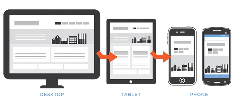
Image source.
Testing Excellence defines RWD as:
An approach to web design aimed at crafting sites to provide an optimal viewing experience—easy reading and navigation with a minimum of resizing, panning, and scrolling—across a wide range of devices (from desktop computer monitors to mobile phones).
Like a chameleon, your website needs to adapt to its surroundings—a one website fits all (screens) situation.
Otherwise put, when users visit your website on their phone or tablet, they shouldn’t have to pinch to zoom in and out to navigate your content.
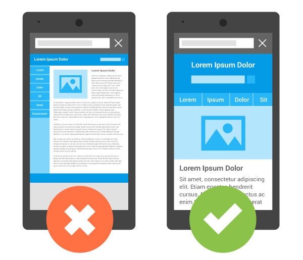
Image source.
In Neil Patel‘s words, “if users have to squint, scroll horizontally and vertically, or repeatedly pinch to zoom, they won’t spend time on your site.”
If you’re reading this blog on a desktop, play around with your screen size and watch the font size and layout adjust as you do.
If you look at Dropbox’s web design, you’ll see that it’s responsive (the design changes with the screen size):
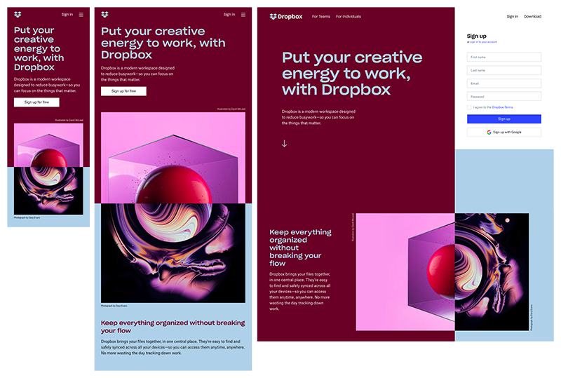
Image source.
So, why does your company care?
In the words of RTOWN Web Developer, Jonathan Funk, “RWD is becoming the standard in the web industry. Skimping on mobile responsiveness means you’re cutting out a chunk of your visitors.”
Here are 3 reasons why your business should have a responsive website:
1. You should give the people what they want.
52% of all global website traffic in 2018 was generated through mobile, so it makes sense to hear that users have high—and cutthroat—expectations for their mobile experience.
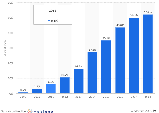
Image source.
Some stats to prove it:
- 57% of internet users state that they will not recommend a business with a poorly designed mobile site.
- 85% of adults feel that a company’s mobile viewing experience should be “as good or better” than its desktop website.
2. Google says so.
Responsive websites are an industry best practice. Google plainly states “responsive design is Google’s recommended design pattern”.
Why?
Websites with RWD only have one URL and the same HTML (versus other configurations where the mobile site URL is different from the desktop site URL).
This means that it’s easier for Google’s algorithm to index your site—which means faster load times and a better user experience.
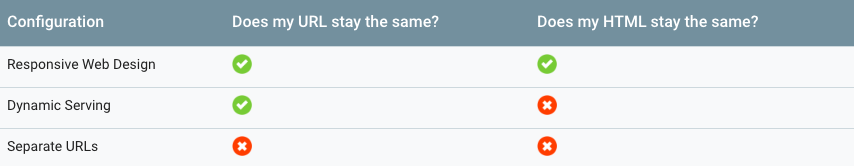 Image source.
To learn more about this, visit Google’s Guide to RWD.
3. If you don’t have a mobile-optimized site, you’ll slide down the rankings.
Last March, Google officially announced that it’s using mobile-first indexing.
Google describes:
“Our crawling, indexing, and ranking systems have typically used the desktop version of a page’s content … Mobile-first indexing means that we’ll use the mobile version of the page for indexing and ranking, to better help our – primarily mobile – users find what they’re looking for.”
The difference between desktop-first and mobile-first indexing:
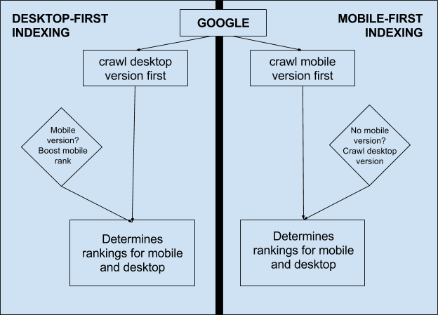
Bridget Randolph at Moz explains: “The mobile version of your website [is now] the starting point for what Google includes in their index, and the baseline for how they determine rankings.”
Simply put, the mobile version of your website is now considered the primary one, so it will more directly impact your overall ranking.
In the words of Neil Patel, “if your website is not mobile-friendly, people won’t see it and won’t read it. It’s just that simple.”
As you’ve probably guessed, creating a responsive website takes time and expertise.
So, what are your options?
If you can code: There are lots of tutorials online on how to build a responsive website, like this one.
For some design inspiration, check out this list of 11 powerful examples from companies like Slack, MagicLeap (who has a cool website experience overall), and Shopify.
If you can’t code: You’ll need to pick a website builder with mobile-friendly themes (like Squarespace or Wix) or hire a professional to build one for you.
Conclusion
Based on the sheer number of prospects and customers accessing your website via mobile (the Canadian numbers are similar to the global ones), a responsive and mobile-friendly site is a worthwhile and necessary investment.
Your business, like a chameleon, needs to adapt to survive.
And what better time to do it than the start of a new year?
2019—coming in hot… and responsive.

{{cta(‘0c4b601b-ea90-4d37-9247-96cbc601d526′,’justifycenter’)}}
RTOWN is a data-driven digital marketing agency that specializes in building responsive websites. We’re dedicated to helping local businesses succeed, so if you’re ready to optimize your website, get in touch.


